Головний фронтендер Stack Overflow Аарон Шекей (Aaron Shekey) розповів у блозі, як його команда додавала на сайт конфеті: святкові анімації для привітання з будь-чим. Нам видався цікавим його підхід, тож публікуємо переклад цього тексту і сподіваємось, він буде для вас корисним.
Частенько у нашому продукті з'являтимуться різноманітні святкові привітання. Вітаємо. Ви зробили чудову справу! Гарна робота! Ви отримали цю можливість! Браво!
До нашої дизайн-системи Stacks, ми нещодавно додали стандартний спосіб показувати святкові конфеті, який можна застосовувати будь-де.
Спочатку, коли нам потрібно було показати конфеті, ми просто включили статично візуалізоване SVG-зображення конфеті до фону. Тоді ми зробили все можливе, щоб відокремити текст від самих конфеті й рухатися далі. Ось як це виглядало:

Лише за кілька місяців ми побачили 12 випадків застосування цього підходу у різних куточках нашого продукту. Кожна нова версія мала певні відмінності. Незабаром у нас з'явилися інші варіанти, як-от confetti-bold.svg.

Нам слід бути послідовними у розробці конфеті, адже вони мають легко застосовуватись в інших місцях і бути (це, мабуть, найголовніше) задокументованими. Саме час зробити це!
Дослідження
Багато користувачів Stack Overflow знають, що найкращий спосіб почати роботу — це створити хороший приклад. На щастя, існує безліч прикладів конфеті у багатьох продуктах в інтернеті. Застосунки, як-от Bamboo, використовують його для привітань з ювілеями та днями народжень. Carta застосовує конфеті, коли ви запускаєте нові послуги.
Деякі з них візуалізовані за допомогою JavaScript, інші — через GIF-анімації. Трапляються й майже фільми, створені через WebGL і Three.JS.
Для Stack Overflow потрібен був варіант, який би працював скрізь з найменшими змінами, створений на якнайчистіших HTML та CSS. Нам не хотілося мати тут жодних залежностей. Ми також не хотіли ініціалізувати JS щоразу, коли ми хочемо показати конфеті. Тим паче нам не до вподоби спиратися на додаткові залежності, які нехтують правильними підходами розробки, що ми спостерігали на інших ресурсах.
Шукаючи розв'язок типових проблем, я часто починаю з Codepen. Це привело мене до сторінки Енді О'Браєна (Andy O'Brien).
Його підхід простий і елегантний, о, так, ще й з нескінченно повторюваною анімацією! Він застосовує CSS, згенерований із SASS для анімації окремих DOM-елементів. Його витвір також схожий на найновішу версію конфеті нашої дизайнерки Вівіан Чжан (Vivian Zhang).
Я форкнув його роботу до свого Codepen, щоб розібратися, як все влаштовано. Я налаштував палітру та почав гратися зі змінними таймінгів. Щойно я розібрався, то доопрацював кольори й розмістив елемент конфеті в одному з наших вітальних вікон.
Але цей підхід має певні недоліки. У багатьох частинах сайту ми мали досить розрізнену будову компонентів. Це заважало просто додати код до кількох частин одночасно. Тож наші інженери повинні були скопіювати та вставити до біса багато блоків <div> з confetti-piece та обов'язково прилаштовувати z-index та змінювати події мишки, щоб з'являлося конфеті.
Цей підхід також застосовує абсолютне позиціювання та flexbox, щоб додати конфеті на весь блок. Тобто, якщо використовувати його у великому контейнері, воно розтягується на всю площу, а не повторюється, як плитка.
Звісно, сам творчий задум нам сподобався.
Я впевнений, якби ми не додавали конфеті у вигляді елемента DOM, то могли б помістити все це до SVG та додати його фоновим зображенням. Це дало б нам додаткові можливості, щоб керувати позиціюванням, розміром та повторюваністю.
Створення SVG
Ну, гаразд, тоді додаємо SVG фоновим зображенням? Гайда спробуємо. По-перше, мені довелося створити елемент SVG, щоб розмістити деталі конфеті. Потрібно лише розподілити прямокутники в блоці та вибрати потрібні нам розміри. Це просто заміна нашого DOM, портативність якого ми досліджували в попередніх прикладах із Codepen.
Я скористався Figma, щоб намалювати це для заощадження часу, але все це можна написати від руки. Ось результат:
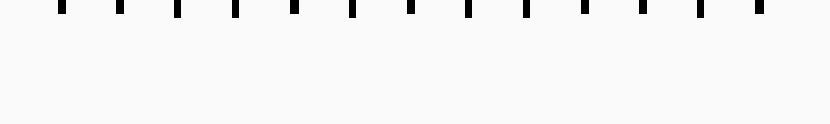
<svg width="600" height="90" viewBox="0 0 600 90" fill="none" xmlns="http://www.w3.org/2000/svg">
    <rect x="42" y="0" width="6" height="10"/>
    <rect x="84" y="0" width="6" height="10"/>
    <rect x="126" y="0" width="5" height="13"/>
    <rect x="168" y="0" width="5" height="13"/>
    <rect x="210" y="0" width="6" height="10"/>
    <rect x="252" y="0" width="5" height="13"/>
    <rect x="294" y="0" width="6" height="10"/>
    <rect x="336" y="0" width="5" height="13"/>
    <rect x="378" y="0" width="5" height="13"/>
    <rect x="420" y="0" width="6" height="10"/>
    <rect x="462" y="0" width="6" height="10"/>
    <rect x="504" y="0" width="5" height="13"/>
    <rect x="546" y="0" width="6" height="10"/>
</svg>
Тепер, коли я отримав елемент SVG, я можу вбудувати в нього CSS і браузер зробить свою справу. Оригінальний підхід Енді полягав в тому, щоб забарвити, обернути й розташувати різні елементи конфеті за допомогою CSS-селектора nth-child. Спочатку мій SVG було структуровано так:
<svg>
    <style type="text/css">...</style>
    <rect />
</svg>
Йой! Але тепер CSS-селектори nth-child вимикаються один за одним, оскільки CSS вважає елемент style дочірнім. Думаю, ми перенесемо це до низу.
До того ж функції Sass не працюватимуть у нашому SVG, тож нам доведеться скомпілювати його як CSS і вставити його в наш SVG. Codepen може скомпілювати це за нас, а я можу копіювати та вставляти. Потроху скотилися до чаклунства!😛
<svg width="600" height="90" viewBox="0 0 600 90" fill="none" xmlns="http://www.w3.org/2000/svg">
    <rect x="42" y="0" width="6" height="10"/>
    <rect x="84" y="0" width="6" height="10"/>
    <rect x="126" y="0" width="5" height="13"/>
    <rect x="168" y="0" width="5" height="13"/>
    <rect x="210" y="0" width="6" height="10"/>
    <rect x="252" y="0" width="5" height="13"/>
    <rect x="294" y="0" width="6" height="10"/>
    <rect x="336" y="0" width="5" height="13"/>
    <rect x="378" y="0" width="5" height="13"/>
    <rect x="420" y="0" width="6" height="10"/>
    <rect x="462" y="0" width="6" height="10"/>
    <rect x="504" y="0" width="5" height="13"/>
    <rect x="546" y="0" width="6" height="10"/>

    <style type="text/css">
        rect {
            opacity: 0;
        }
        rect:nth-child(1) {
            transform: rotate(-145deg);
            animation: blast 700ms infinite ease-out;
            animation-delay: 88ms;
            animation-duration: 631ms;
        }
        rect:nth-child(2) {
            transform: rotate(164deg);
            animation: blast 700ms infinite ease-out;
            animation-delay: 131ms;
            animation-duration: 442ms;
        }
        rect:nth-child(3) {
            transform: rotate(4deg);
            animation: blast 700ms infinite ease-out;
            animation-delay: 92ms;
            animation-duration: 662ms;
        }
        rect:nth-child(4) {
            transform: rotate(-175deg);
            animation: blast 700ms infinite ease-out;
            animation-delay: 17ms;
            animation-duration: 593ms;
        }
        rect:nth-child(5) {
            transform: rotate(-97deg);
            animation: blast 700ms infinite ease-out;
            animation-delay: 122ms;
            animation-duration: 476ms;
        }
        rect:nth-child(6) {
            transform: rotate(57deg);
            animation: blast 700ms infinite ease-out;
            animation-delay: 271ms;
            animation-duration: 381ms;
        }
        rect:nth-child(7) {
            transform: rotate(-46deg);
            animation: blast 700ms infinite ease-out;
            animation-delay: 131ms;
            animation-duration: 619ms;
        }
        rect:nth-child(8) {
            transform: rotate(-65deg);
            animation: blast 700ms infinite ease-out;
            animation-delay: 85ms;
            animation-duration: 668ms;
        }
        rect:nth-child(9) {
            transform: rotate(13deg);
            animation: blast 700ms infinite ease-out;
            animation-delay: 128ms;
            animation-duration: 377ms;
        }
        rect:nth-child(10) {
            transform: rotate(176deg);
            animation: blast 700ms infinite ease-out;
            animation-delay: 311ms;
            animation-duration: 508ms;
        }
        rect:nth-child(11) {
            transform: rotate(108deg);
            animation: blast 700ms infinite ease-out;
            animation-delay: 108ms;
            animation-duration: 595ms;
        }
        rect:nth-child(12) {
            transform: rotate(62deg);
            animation: blast 700ms infinite ease-out;
            animation-delay: 105ms;
            animation-duration: 375ms;
        }
        rect:nth-child(13) {
            transform: rotate(16deg);
            animation: blast 700ms infinite ease-out;
            animation-delay: 149ms;
            animation-duration: 491ms;
        }
        rect:nth-child(odd) {
            fill: #65BB5C;
        }
        rect:nth-child(even) {
            z-index: 1;
            fill: #33AAFF;
        }
        rect:nth-child(4n) {
            animation-duration: 1400ms;
            fill: #F23B14;
        }
        rect:nth-child(3n) {
            animation-duration: 1750ms;
            animation-delay: 700ms;
        }
        rect:nth-child(4n-7) {
            fill: #2A2F6A;
        }
        rect:nth-child(6n) {
            fill: #FBBA23;
        }

        @keyframes blast {
            from {
                opacity: 0;
            }
            20% {
                opacity: 1;
            }
            to {
                transform: translateY(90px);
            }
        }
    </style>
</svg>
Гаразд, анбелівебелді! Отже, якщо ви збережете це добро як SVG і відкриєте у своєму браузері, то побачите анімоване конфеті. Але є якась біда з позиціюванням наших конфеті. Коли це були елементи DOM, вони просто працювали. Щось мусимо змінити у SVG.
Якщо ви здогадалися, що SVG має інші точки відліку координат перетворень (transform origins), то мали рацію. У DOM, якщо ви щось обертаєте за допомогою CSS, воно просто автоматично обертається у центрі елемента. У SVG початкове значення це 0,0 — тобто вгорі ліворуч нашого блока 🤦♂️.
Я обійшов це, вимірявши відстані у Figma і захардкодив деякі точки відліку координат перетворень, наприклад, transform-origin: 45px 5px; Ці точки не є ідеальним центром прямокутників, але вони досить близькі до нього.
<svg width="600" height="90" viewBox="0 0 600 90" fill="none" xmlns="http://www.w3.org/2000/svg">
    <rect x="42" y="0" width="6" height="10"/>
    <rect x="84" y="0" width="6" height="10"/>
    <rect x="126" y="0" width="5" height="13"/>
    <rect x="168" y="0" width="5" height="13"/>
    <rect x="210" y="0" width="6" height="10"/>
    <rect x="252" y="0" width="5" height="13"/>
    <rect x="294" y="0" width="6" height="10"/>
    <rect x="336" y="0" width="5" height="13"/>
    <rect x="378" y="0" width="5" height="13"/>
    <rect x="420" y="0" width="6" height="10"/>
    <rect x="462" y="0" width="6" height="10"/>
    <rect x="504" y="0" width="5" height="13"/>
    <rect x="546" y="0" width="6" height="10"/>

    <style type="text/css">
        rect {
            opacity: 0;
        }
        rect:nth-child(1) {
            transform-origin: 45px 5px;
            transform: rotate(-145deg);
            animation: blast 700ms infinite ease-out;
            animation-delay: 88ms;
            animation-duration: 631ms;
        }
        rect:nth-child(2) {
            transform-origin: 87px 5px;
            transform: rotate(164deg);
            animation: blast 700ms infinite ease-out;
            animation-delay: 131ms;
            animation-duration: 442ms;
        }
        rect:nth-child(3) {
            transform-origin: 128px 6px;
            transform: rotate(4deg);
            animation: blast 700ms infinite ease-out;
            animation-delay: 92ms;
            animation-duration: 662ms;
        }
        rect:nth-child(4) {
            transform-origin: 170px 6px;
            transform: rotate(-175deg);
            animation: blast 700ms infinite ease-out;
            animation-delay: 17ms;
            animation-duration: 593ms;
        }
        rect:nth-child(5) {
            transform-origin: 213px 5px;
            transform: rotate(-97deg);
            animation: blast 700ms infinite ease-out;
            animation-delay: 122ms;
            animation-duration: 476ms;
        }
        rect:nth-child(6) {
            transform-origin: 255px 6px;
            transform: rotate(57deg);
            animation: blast 700ms infinite ease-out;
            animation-delay: 271ms;
            animation-duration: 381ms;
        }
        rect:nth-child(7) {
            transform-origin: 297px 5px;
            transform: rotate(-46deg);
            animation: blast 700ms infinite ease-out;
            animation-delay: 131ms;
            animation-duration: 619ms;
        }
        rect:nth-child(8) {
            transform-origin: 338px 6px;
            transform: rotate(-65deg);
            animation: blast 700ms infinite ease-out;
            animation-delay: 85ms;
            animation-duration: 668ms;
        }
        rect:nth-child(9) {
            transform-origin: 380px 6px;
            transform: rotate(13deg);
            animation: blast 700ms infinite ease-out;
            animation-delay: 128ms;
            animation-duration: 377ms;
        }
        rect:nth-child(10) {
            transform-origin: 423px 5px;
            transform: rotate(176deg);
            animation: blast 700ms infinite ease-out;
            animation-delay: 311ms;
            animation-duration: 508ms;
        }
        rect:nth-child(11) {
            transform-origin: 465px 5px;
            transform: rotate(108deg);
            animation: blast 700ms infinite ease-out;
            animation-delay: 108ms;
            animation-duration: 595ms;
        }
        rect:nth-child(12) {
            transform-origin: 506px 6px;
            transform: rotate(62deg);
            animation: blast 700ms infinite ease-out;
            animation-delay: 105ms;
            animation-duration: 375ms;
        }
        rect:nth-child(13) {
            transform-origin: 549px 5px;
            transform: rotate(16deg);
            animation: blast 700ms infinite ease-out;
            animation-delay: 149ms;
            animation-duration: 491ms;
        }
        rect:nth-child(odd) {
            fill: #65BB5C;
        }
        rect:nth-child(even) {
            z-index: 1;
            fill: #33AAFF;
        }
        rect:nth-child(4n) {
            animation-duration: 1400ms;
            fill: #F23B14;
        }
        rect:nth-child(3n) {
            animation-duration: 1750ms;
            animation-delay: 700ms;
        }
        rect:nth-child(4n-7) {
            fill: #2A2F6A;
        }
        rect:nth-child(6n) {
            fill: #FBBA23;
        }

        @keyframes blast {
            from {
                opacity: 0;
            }
            20% {
                opacity: 1;
            }
            to {
                transform: translateY(90px);
            }
        }
    </style>
</svg>
Ще одна маленька хитрість. Оскільки у SVG точки відліку координат перетворень розміщено дещо інакше, я помічаю, що внизу у мене є кілька шматочків конфеті, які обрізаються в кінці анімації. Ми можемо виправити це, перемістивши наші шматочки вище за блок.
<rect x="42" y="-10" width="6" height="10"/>
<rect x="84" y="-10" width="6" height="10"/>
<rect x="126" y="-13" width="5" height="13"/>
<rect x="168" y="-13" width="5" height="13"/>
<rect x="210" y="-10" width="6" height="10"/>
<rect x="252" y="-13" width="5" height="13"/>
<rect x="294" y="-10" width="6" height="10"/>
<rect x="336" y="-13" width="5" height="13"/>
<rect x="378" y="-13" width="5" height="13"/>
<rect x="420" y="-10" width="6" height="10"/>
<rect x="462" y="-10" width="6" height="10"/>
<rect x="504" y="-13" width="5" height="13"/>
<rect x="546" y="-10" width="6" height="10"/>
Впровадження
Чудово! Ми отримали єдиний файл SVG, який обробляє всю анімацію. Тепер ми підставляємо його фоновим зображенням у будь-який потрібний нам елемент. З таймінгом анімації, кольорами та розмірами теж все гаразд.
Ми могли б зупинитися тут і впевнитися, що кожен з проєктів має цей файл .svg десь у файловій системі…
АБО ми могли б додатково інкапсулювати його, перекодувавши весь SVG (разом з CSS) до файлу CSS нашої дизайн-системи. CSS у SVG у CSS? Чому ні? 🤯
Це настільки ж просто, як перекодування SVG у фонове зображення, як ось:
.bg-confetti-animated {
    background-repeat: repeat-x;
    background-position: top -10px center;
    background-image: url("data:image/svg+xml,%3Csvg width='600' height='90' viewBox='0 0 600 90' fill='none' xmlns='https://web.archive.org/web/20230322031907/http://www.w3.org/2000/svg'%3E%3Crect x='42' y='-10' width='6' height='10'/%3E%3Crect x='84' y='-10' width='6' height='10'/%3E%3Crect x='126' y='-13' width='5' height='13'/%3E%3Crect x='168' y='-13' width='5' height='13'/%3E%3Crect x='210' y='-10' width='6' height='10'/%3E%3Crect x='252' y='-13' width='5' height='13'/%3E%3Crect x='294' y='-10' width='6' height='10'/%3E%3Crect x='336' y='-13' width='5' height='13'/%3E%3Crect x='378' y='-13' width='5' height='13'/%3E%3Crect x='420' y='-10' width='6' height='10'/%3E%3Crect x='462' y='-10' width='6' height='10'/%3E%3Crect x='504' y='-13' width='5' height='13'/%3E%3Crect x='546' y='-10' width='6' height='10'/%3E%3Cstyle type='text/css'%3E rect %7B opacity: 0; %7D rect:nth-child(1) %7B transform-origin: 45px 5px; transform: rotate(-145deg); animation: blast 700ms infinite ease-out; animation-delay: 88ms; animation-duration: 631ms; %7D rect:nth-child(2) %7B transform-origin: 87px 5px; transform: rotate(164deg); animation: blast 700ms infinite ease-out; animation-delay: 131ms; animation-duration: 442ms; %7D rect:nth-child(3) %7B transform-origin: 128px 6px; transform: rotate(4deg); animation: blast 700ms infinite ease-out; animation-delay: 92ms; animation-duration: 662ms; %7D rect:nth-child(4) %7B transform-origin: 170px 6px; transform: rotate(-175deg); animation: blast 700ms infinite ease-out; animation-delay: 17ms; animation-duration: 593ms; %7D rect:nth-child(5) %7B transform-origin: 213px 5px; transform: rotate(-97deg); animation: blast 700ms infinite ease-out; animation-delay: 122ms; animation-duration: 476ms; %7D rect:nth-child(6) %7B transform-origin: 255px 6px; transform: rotate(57deg); animation: blast 700ms infinite ease-out; animation-delay: 271ms; animation-duration: 381ms; %7D rect:nth-child(7) %7B transform-origin: 297px 5px; transform: rotate(-46deg); animation: blast 700ms infinite ease-out; animation-delay: 131ms; animation-duration: 619ms; %7D rect:nth-child(8) %7B transform-origin: 338px 6px; transform: rotate(-65deg); animation: blast 700ms infinite ease-out; animation-delay: 85ms; animation-duration: 668ms; %7D rect:nth-child(9) %7B transform-origin: 380px 6px; transform: rotate(13deg); animation: blast 700ms infinite ease-out; animation-delay: 128ms; animation-duration: 377ms; %7D rect:nth-child(10) %7B transform-origin: 423px 5px; transform: rotate(176deg); animation: blast 700ms infinite ease-out; animation-delay: 311ms; animation-duration: 508ms; %7D rect:nth-child(11) %7B transform-origin: 465px 5px; transform: rotate(108deg); animation: blast 700ms infinite ease-out; animation-delay: 108ms; animation-duration: 595ms; %7D rect:nth-child(12) %7B transform-origin: 506px 6px; transform: rotate(62deg); animation: blast 700ms infinite ease-out; animation-delay: 105ms; animation-duration: 375ms; %7D rect:nth-child(13) %7B transform-origin: 549px 5px; transform: rotate(16deg); animation: blast 700ms infinite ease-out; animation-delay: 149ms; animation-duration: 491ms; %7D rect:nth-child(odd) %7B fill: %2365BB5C; %7D rect:nth-child(even) %7B z-index: 1; fill: %2333AAFF; %7D rect:nth-child(4n) %7B animation-duration: 1400ms; fill: %23F23B14; %7D rect:nth-child(3n) %7B animation-duration: 1750ms; animation-delay: 700ms; %7D rect:nth-child(4n-7) %7B fill: %232A2F6A; %7D rect:nth-child(6n) %7B fill: %23FBBA23; %7D @keyframes blast %7B from %7B opacity: 0; %7D 20%25 %7B opacity: 1; %7D to %7B transform: translateY(90px); %7D %7D %3C/style%3E%3C/svg%3E%0A");
}
Коли я повинен перекодувати щось таке, я користуюсь інструментом yoksel.
Підтримка сповільнення
Деякі люди мають складнощі з анімацією. Інші ж просто не xочуть бачити її взагалі. На щастя, наші браузери пропонують медіазапит для цього: @media (prefers-reduced-motion). Скористаймось ним, щоб показати статично візуалізовану частину конфеті (бо ж, власне, в цьому і полягає наш підхід).
Наша дизайнерка Вівіан люб'язно створила статичну версію конфеті у Figma.

Тепер залишилося лише вбудувати статичну версію за цим медіазапитом:
.bg-confetti-animated {
    background-repeat: repeat-x;
    background-position: top -10px center;
    background-image: url("data:image/svg+xml,%3Csvg width='600' height='90' viewBox='0 0 600 90' fill='none' xmlns='https://web.archive.org/web/20230322031907/http://www.w3.org/2000/svg'%3E%3Crect x='42' y='-10' width='6' height='10'/%3E%3Crect x='84' y='-10' width='6' height='10'/%3E%3Crect x='126' y='-13' width='5' height='13'/%3E%3Crect x='168' y='-13' width='5' height='13'/%3E%3Crect x='210' y='-10' width='6' height='10'/%3E%3Crect x='252' y='-13' width='5' height='13'/%3E%3Crect x='294' y='-10' width='6' height='10'/%3E%3Crect x='336' y='-13' width='5' height='13'/%3E%3Crect x='378' y='-13' width='5' height='13'/%3E%3Crect x='420' y='-10' width='6' height='10'/%3E%3Crect x='462' y='-10' width='6' height='10'/%3E%3Crect x='504' y='-13' width='5' height='13'/%3E%3Crect x='546' y='-10' width='6' height='10'/%3E%3Cstyle type='text/css'%3E rect %7B opacity: 0; %7D rect:nth-child(1) %7B transform-origin: 45px 5px; transform: rotate(-145deg); animation: blast 700ms infinite ease-out; animation-delay: 88ms; animation-duration: 631ms; %7D rect:nth-child(2) %7B transform-origin: 87px 5px; transform: rotate(164deg); animation: blast 700ms infinite ease-out; animation-delay: 131ms; animation-duration: 442ms; %7D rect:nth-child(3) %7B transform-origin: 128px 6px; transform: rotate(4deg); animation: blast 700ms infinite ease-out; animation-delay: 92ms; animation-duration: 662ms; %7D rect:nth-child(4) %7B transform-origin: 170px 6px; transform: rotate(-175deg); animation: blast 700ms infinite ease-out; animation-delay: 17ms; animation-duration: 593ms; %7D rect:nth-child(5) %7B transform-origin: 213px 5px; transform: rotate(-97deg); animation: blast 700ms infinite ease-out; animation-delay: 122ms; animation-duration: 476ms; %7D rect:nth-child(6) %7B transform-origin: 255px 6px; transform: rotate(57deg); animation: blast 700ms infinite ease-out; animation-delay: 271ms; animation-duration: 381ms; %7D rect:nth-child(7) %7B transform-origin: 297px 5px; transform: rotate(-46deg); animation: blast 700ms infinite ease-out; animation-delay: 131ms; animation-duration: 619ms; %7D rect:nth-child(8) %7B transform-origin: 338px 6px; transform: rotate(-65deg); animation: blast 700ms infinite ease-out; animation-delay: 85ms; animation-duration: 668ms; %7D rect:nth-child(9) %7B transform-origin: 380px 6px; transform: rotate(13deg); animation: blast 700ms infinite ease-out; animation-delay: 128ms; animation-duration: 377ms; %7D rect:nth-child(10) %7B transform-origin: 423px 5px; transform: rotate(176deg); animation: blast 700ms infinite ease-out; animation-delay: 311ms; animation-duration: 508ms; %7D rect:nth-child(11) %7B transform-origin: 465px 5px; transform: rotate(108deg); animation: blast 700ms infinite ease-out; animation-delay: 108ms; animation-duration: 595ms; %7D rect:nth-child(12) %7B transform-origin: 506px 6px; transform: rotate(62deg); animation: blast 700ms infinite ease-out; animation-delay: 105ms; animation-duration: 375ms; %7D rect:nth-child(13) %7B transform-origin: 549px 5px; transform: rotate(16deg); animation: blast 700ms infinite ease-out; animation-delay: 149ms; animation-duration: 491ms; %7D rect:nth-child(odd) %7B fill: %2365BB5C; %7D rect:nth-child(even) %7B z-index: 1; fill: %2333AAFF; %7D rect:nth-child(4n) %7B animation-duration: 1400ms; fill: %23F23B14; %7D rect:nth-child(3n) %7B animation-duration: 1750ms; animation-delay: 700ms; %7D rect:nth-child(4n-7) %7B fill: %232A2F6A; %7D rect:nth-child(6n) %7B fill: %23FBBA23; %7D @keyframes blast %7B from %7B opacity: 0; %7D 20%25 %7B opacity: 1; %7D to %7B transform: translateY(90px); %7D %7D %3C/style%3E%3C/svg%3E%0A");

    @media (prefers-reduced-motion) {
        background-image: url("data:image/svg+xml,%3Csvg width='574' height='60' viewBox='0 0 574 60' fill='none' xmlns='https://web.archive.org/web/20230322031907/http://www.w3.org/2000/svg'%3E%3Crect opacity='0.8' x='27.1224' y='20.0458' width='5' height='13' transform='rotate(-139 27.1224 20.0458)' fill='%23F23B14'/%3E%3Crect opacity='0.8' x='118.478' y='7.00201' width='5' height='13' transform='rotate(-38.8114 118.478 7.00201)' fill='%23FBBA23'/%3E%3Crect opacity='0.8' x='504.616' y='25.4479' width='5' height='13' transform='rotate(-60.2734 504.616 25.4479)' fill='%23F23B14'/%3E%3Crect opacity='0.6' x='538.983' y='45.555' width='5' height='13' transform='rotate(16.7826 538.983 45.555)' fill='%232A2F6A'/%3E%3Crect opacity='0.3' x='470.322' y='2.63625' width='5' height='13' transform='rotate(11.295 470.322 2.63625)' fill='%2333AAFF'/%3E%3Crect opacity='0.3' x='190.295' y='4.58138' width='5' height='13' transform='rotate(27.5954 190.295 4.58138)' fill='%23F23B14'/%3E%3Crect opacity='0.8' x='234.303' y='16.3233' width='5' height='13' transform='rotate(-41.8233 234.303 16.3233)' fill='%2365BB5C'/%3E%3Crect opacity='0.6' x='369.702' y='40.9875' width='5' height='13' transform='rotate(-56.419 369.702 40.9875)' fill='%2333AAFF'/%3E%3Crect opacity='0.3' x='402.121' y='31.0848' width='5' height='13' transform='rotate(-17.9234 402.121 31.0848)' fill='%23F23B14'/%3E%3Crect opacity='0.6' x='200.316' y='31.9328' width='5' height='13' transform='rotate(-15.8896 200.316 31.9328)' fill='%232A2F6A'/%3E%3Crect opacity='0.6' x='69.6745' y='23.4725' width='6' height='10' transform='rotate(70.0266 69.6745 23.4725)' fill='%2365BB5C'/%3E%3Crect opacity='0.6' x='291.945' y='7.16931' width='6' height='10' transform='rotate(30.4258 291.945 7.16931)' fill='%23FBBA23'/%3E%3Crect opacity='0.3' x='33.7754' y='38.2208' width='6' height='10' transform='rotate(38.6056 33.7754 38.2208)' fill='%23FBBA23'/%3E%3Crect opacity='0.8' x='109.752' y='31.1743' width='6' height='10' transform='rotate(28.5296 109.752 31.1743)' fill='%2333AAFF'/%3E%3Crect opacity='0.3' x='278.081' y='37.8695' width='6' height='10' transform='rotate(-26.5651 278.081 37.8695)' fill='%23F23B14'/%3E%3Crect opacity='0.8' x='416.294' y='11.5573' width='6' height='10' transform='rotate(-22.8498 416.294 11.5573)' fill='%23FBBA23'/%3E%3Crect opacity='0.3' x='354.667' y='9.32341' width='6' height='10' transform='rotate(17.7506 354.667 9.32341)' fill='%232A2F6A'/%3E%3Crect opacity='0.8' x='532.404' y='16.6372' width='6' height='10' transform='rotate(-75.3432 532.404 16.6372)' fill='%23FBBA23'/%3E%3Crect opacity='0.6' x='460.463' y='39.3557' width='6' height='10' transform='rotate(45.4982 460.463 39.3557)' fill='%2365BB5C'/%3E%3C/svg%3E");
    }
}
Ми також можемо додати це як окремий клас .bg-confetti-static:
.bg-confetti-static {
    background-repeat: repeat-x;
    background-position: top -10px center;
    background-image: url("data:image/svg+xml,%3Csvg width='574' height='60' viewBox='0 0 574 60' fill='none' xmlns='https://web.archive.org/web/20230322031907/http://www.w3.org/2000/svg'%3E%3Crect opacity='0.8' x='27.1224' y='20.0458' width='5' height='13' transform='rotate(-139 27.1224 20.0458)' fill='%23F23B14'/%3E%3Crect opacity='0.8' x='118.478' y='7.00201' width='5' height='13' transform='rotate(-38.8114 118.478 7.00201)' fill='%23FBBA23'/%3E%3Crect opacity='0.8' x='504.616' y='25.4479' width='5' height='13' transform='rotate(-60.2734 504.616 25.4479)' fill='%23F23B14'/%3E%3Crect opacity='0.6' x='538.983' y='45.555' width='5' height='13' transform='rotate(16.7826 538.983 45.555)' fill='%232A2F6A'/%3E%3Crect opacity='0.3' x='470.322' y='2.63625' width='5' height='13' transform='rotate(11.295 470.322 2.63625)' fill='%2333AAFF'/%3E%3Crect opacity='0.3' x='190.295' y='4.58138' width='5' height='13' transform='rotate(27.5954 190.295 4.58138)' fill='%23F23B14'/%3E%3Crect opacity='0.8' x='234.303' y='16.3233' width='5' height='13' transform='rotate(-41.8233 234.303 16.3233)' fill='%2365BB5C'/%3E%3Crect opacity='0.6' x='369.702' y='40.9875' width='5' height='13' transform='rotate(-56.419 369.702 40.9875)' fill='%2333AAFF'/%3E%3Crect opacity='0.3' x='402.121' y='31.0848' width='5' height='13' transform='rotate(-17.9234 402.121 31.0848)' fill='%23F23B14'/%3E%3Crect opacity='0.6' x='200.316' y='31.9328' width='5' height='13' transform='rotate(-15.8896 200.316 31.9328)' fill='%232A2F6A'/%3E%3Crect opacity='0.6' x='69.6745' y='23.4725' width='6' height='10' transform='rotate(70.0266 69.6745 23.4725)' fill='%2365BB5C'/%3E%3Crect opacity='0.6' x='291.945' y='7.16931' width='6' height='10' transform='rotate(30.4258 291.945 7.16931)' fill='%23FBBA23'/%3E%3Crect opacity='0.3' x='33.7754' y='38.2208' width='6' height='10' transform='rotate(38.6056 33.7754 38.2208)' fill='%23FBBA23'/%3E%3Crect opacity='0.8' x='109.752' y='31.1743' width='6' height='10' transform='rotate(28.5296 109.752 31.1743)' fill='%2333AAFF'/%3E%3Crect opacity='0.3' x='278.081' y='37.8695' width='6' height='10' transform='rotate(-26.5651 278.081 37.8695)' fill='%23F23B14'/%3E%3Crect opacity='0.8' x='416.294' y='11.5573' width='6' height='10' transform='rotate(-22.8498 416.294 11.5573)' fill='%23FBBA23'/%3E%3Crect opacity='0.3' x='354.667' y='9.32341' width='6' height='10' transform='rotate(17.7506 354.667 9.32341)' fill='%232A2F6A'/%3E%3Crect opacity='0.8' x='532.404' y='16.6372' width='6' height='10' transform='rotate(-75.3432 532.404 16.6372)' fill='%23FBBA23'/%3E%3Crect opacity='0.6' x='460.463' y='39.3557' width='6' height='10' transform='rotate(45.4982 460.463 39.3557)' fill='%2365BB5C'/%3E%3C/svg%3E");
}
Нарешті все готово! Зараз наші інженери та дизайнери мають єдиний клас .bg-confetti-animated, який вони можуть додавати до будь-якого блокового елемента. Ви можете докладніше ознайомитися з документацією нашої дизайн-системи Stacks і дізнатись, як ми розширили її для стилізації модальних вікон.
Ось і все. Конфеті з CSS у SVG у CSS готове. 🎉 Жодних додаткових залежностей, і все це просто включено до нашого CSS.

Ще немає коментарів